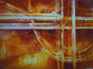
 …. And It Comes Out Here, 1992
Talk about scratching an itch! We have heard from quite a number of people who are excited to be pouring paint (see February technique) and are eager to do more. If you haven’t already read Pouring Paint before now, go back and work you way through the February entry first.
If you are ready to go again — what about those containers of unused paint? I have been watering mine, just like house plants. Add water to the container and stir. There are the colors! Or make up some new ones.
What else can you do with the pours? Look at the things you have. Put them up and study them a while. You may be reluctant to go in and “finish” them. May I suggest, doing as little as possible? This means, planning ahead.
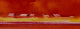
Template and scrub:
In Skagit Fire, all I had after the pour were bands of yellow and red. I decided the pink band between the red and yellow looked like a plowed strip and the poofs of yellow in the red looked like fire clouds — so I put down pieces of masking tape to make templates for roofs. Then, one by one, I scrubbed the pigment out of the roof shape, using a soft moistened toothbrush. In the close up, you can see that just the tiniest bit of additional color was added to the shade sides of the building (see Feb. technique for a photo of the complete painting).
Negative painting: After the pour of Worthy Adversaries (again see full painting in last month’s discussion), I had a great wave, perhaps a passage between headlands, and I thought the color under the wave implied depth. After a long time with the painting pinned up, I envisioned an old clipper ship  coming through the passage. It was threatened not only by the weather but hidden rocks. Negative painting out the rocks was a tricky business. You need to get in and get out without disturbing the poured paint. It can dissolve if you fuss and you will have a mess! Be gentle. Be decisive. Do it and set it aside to dry before you go on.
I found a photo of a clipper ship. However, it was under full sail and in this weather most of the big sails would be furled. Could I make it up? I used the photo to help me draw the hull and bowsprit. I drew 4 foresails flying and furled the rest. I painted the shape of the hull and 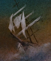 scrubbed out the color, blotting off the clean water and with the damp tissue lifting what looked like a bow wave. Then tape masks were constructed one by one, and I scrubbed out the color for the sails with a soft damp tooth brush. Painted a quick indication of masts. No fussing. In and out.
The same techniques were used with Into the Calm, the single boat coming through the narrow passage. When the pour was wet, I had put down some Saran Wrap to dry on top of the pour so there were texture areas that just had to be rocks. These were negative painted as described above.
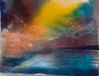 I wasn’t sure that I could get the yellow area to quiet down. It was much brighter on the upper right as shown in this early stage. Several pours deepened that area, pushing the glow toward the middle. The streaks in the water are mainly lifted out with a “thirsty” (damp dry) 1-inch flat brush when the painting was wet with a second pour. I constructed the template of the sailboat out of tape and scrubbed the shape out of the dried color in the center. The feeling, to me, was a boat approaching calm waters after a challenging passage.
 Here is what a scrubbed shape looks like, and a tape mask ready to make another:
Using resists: …. And It Comes Out Here started in a workshop when I was teaching resists and pouring. I taped the grid and flung some Miskit on a stretched full sheet (Arches, 140 cold press), then did a yellow pour. After it dried, I taped some more grid, and did the large swirling shapes with Miskit and a brush (they show up as yellow from the yellow pour). The red was the next pour. Then what? Set it up and study it.
The painting suggested pipes when it was on its side and a treble clef staff when vertical. I finally decided I would go with the pipes, painted in the joints and the negative darks. Cadmium yellow, cadmium red medium, alizeran crimson, and a violet are the pigments used — a hot palette! For the title, I wanted something that was both music (the clef) and plumbing so chose a segment of Louis Prima’s The Music Goes Round and Round…for the title. I have to report that the painting won the sweepstakes at the Watercolor Society of Oregon the last year I lived there and could still qualify to enter.
None of these paintings were finished immediately after the pour. I pinned each up on the wall of my studio and studied it quite a while until I could imagine the shapes. When you decide what it will be — do a drawing or a plan. Don’t muck around! Get in and get out. And have fun!
Happy painting,
Caroline
© 2009
