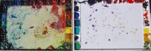
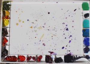
my 20-year old and my new palette
There are a lot of opinions about which pigments to buy and why. And, yes, I hold some strong opinions on the subject. Because of some recent conversations I think it is time to share with you (again, for some) why I choose the pigments I do — and a little of the back story of how I have arrived at these 20 pigments. I hope it will help you as you decide what to include on your palette.
There are so many beautiful pigments out there, how do you choose? How many do you need? How do you put them on your palette?
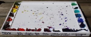
pigment names on the lid of a John Pike palette
In the middle part of the twentieth century artists didn’t have nearly the variety of pigments we have now. When I started painting seriously in watercolor in the seventies you saw a lot of paintings using of Yellow Ochre, Burnt Sienna, Lamp Black – called the “Rembrandt Palette.” And sometimes Ultramarine Blue. Payne’s Gray was popular. Lamp Black and Payne’s Gray are basically made of soot and that is what you are putting on your paper when you use them.
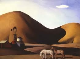
Millard Sheets, typical palette of colors
In 1984 the Oregon Watercolor Society held a 25-year retrospective show featuring a prize winner from each of the 25 years of the Society’s existence. Color-filled paintings didn’t appear until the late 70’s and early 80’s. Tastes were changing.
And pigments were changing. The big art pigment manufacturer was Windsor Newton, with a list of pigments that had not changed much over the years. Cottman made a student grade that was popular in price but very chalky. Daniel Smith Ink decided to go into the making of paint and charged their chemist with going out into industry and seeing what other colors were out there. We were given small samples to test for color, viscosity and several other criteria. After several years of testing the art world received amazing
colors: all the Quinacridones, Perinone Orange and so many more. Which to choose? I couldn’t even pronounce half of them!!
my original palette (about 1993)
As we discussed last month, I like to work with the colors (hues) we perceive in sunlight, in the rainbow.
But we have to deal with minerals and organic dyes to approximate these colors. This is pigment quality.
For a number of years I had been teaching
- Use the dye or staining pigments for your first layers of wet-on-wet and wet blending.
- They go into solution easily and intermingle with other hues in wonderful nuances
- They bond with the paper as they dry and so stay down when glazed over with other colors
- They are clear and strong, given excellent undertones when you are planning more than one layer of color
- They are NOT good when a full saturation is glazed over another strong color – they go flat and dull
- and you CAN remove them if they go where yo don’t want during the wet stage
- Save sedimentary pigments for final work
- for developing colorful darks by “floating” the sedimentary pigment over the original dyes
- for giving surface texture or tooth to areas
- They are NOT good for early washes and first layers of painting because they dissolve in the later glazes and make mud
- Use the luminous pigments such as Cobalt blue, Aureolin yellow and Viridian for fine tuning or when you want a light, clear hue.
After the new Daniel Smith colors came in I found that many of the new ones could be used any time: the quinacridones, green gold, perinone orange. I worked out the palette below and more than 20 years later have only dropped Viridian and added Quinacridone Violet.
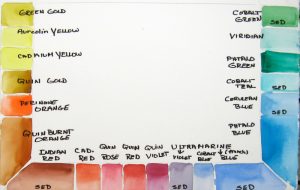
new John Pike palette – quin purple is between quin violet and ultramarine violet, pushing ultramarine blue around the corner
You have only 20 holes in your palette. Wich pigments are you going to choose?
My choices:
Dyes or “stains”
- green gold
- aureolin yellow
- ? a pure clear yellow — the old cadmium yellow light was great but is discontinued; don’t buy the mix – cadmium “hue” – maybe Hansa yellow light? Still experimenting….
- quinacridone gold
- perinone orange
- quinacridone burnt orange (not prismatic)
- quinacridone rose (or coral ?)
- quinacridone red (there are other good reds)
- quinacridone violet
- quinacridone purple
- thalo blue
- thalo green
Sedimentary pigments
- Indian red
- cadmium red
- ultramarine violet
- cobalt blue
- ultramarine blue
- cerulean blue
- cobalt teal
- cobalt green
You can mix your sedimentary pigments with some of the dyes to achieve hue adjustments. But do your own mixing so you understand what you are doing. I would stay away from premixed tubes of “granulating” pigments. A dye is mixed with a sedimentary paint so you are not in control when to use it and what effects to expect.
You could get by with only 6 colors — the six of the rainbow. Or 8 – add ultramarine blue and burnt orange. Or 10 – quin gold and ?
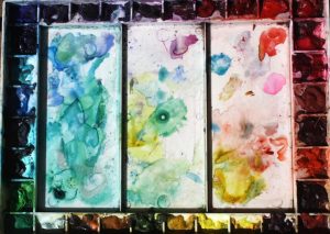
Another rainbow palette, more colors (more confusion?). Notice how, with a color-wheel arrangement, you get the mixes in the center also in a wheel making it very easy to modify a hue as you work
Or get a palette with more holes and squeeze out more colors. Fun? Or confusing? I find you don’t need this many.
I could go on …. and will! We will talk about the article explaining these choices next month. In the meantime start organizing your pigments in a color wheel that includes both dyes (full circle of hues) and sedimentary ppigments for augmentation.
Or come to the August class on Orcas, Avoiding Mud for some “hands on” work. We will be working on pigment quality along with other aspects of this issue.
You may want to combine it with Saving Whites for a really excellent week!
Happy painting!
Caroline
© Caroline Buchanan, 2017