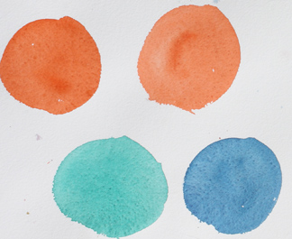
Perinone Orange (2), thalo green, thalo blue
I don’t believe in many absolutes in art. Art is the response to a statement of “This MUST be …..” with a “Oh yeah?” and going on to prove the statement wrong.
But one I believe — and I admit this is just me — is DON’T MIX the two colors together when you can either wet blend them or glaze them. Why?
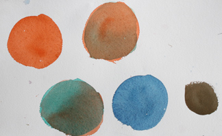
green over orange, orange over green, orange and blue mixed
- Watercolor is transparent and because of this we can see through one color to the next.
- The colors in watercolor flow in the water and intermingle in ways that delight the eye.
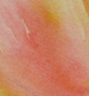

yellow and orange flowing into each other in a wet-blended tulip. flat orange, no mix
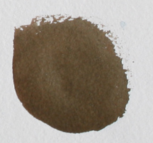 On the left is a brown achieved by the same orange and blue as you see in the upper examples (a little more blue and it would have been gray). There is a place for the flat dull colors to enhance the livelier areas I will admit. But why not charge your brown with a little violet here, a little more blue there, or a bit of green down here?
This is called wet blending, It takes advantage of the way pigments intermingle in water.
Glazing is any time you add a color over another that has already dried.
I look for every excuse I can to either wet blend or glaze.

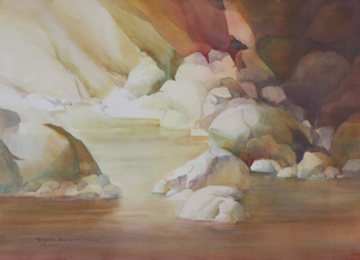
Here are some examples in the development of Silent Slumber:
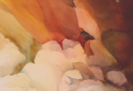
Many layers went into the subtle shifts in color — not adequately reproduced here. There is a visual pleasure when one sees a ceurlean blue over a red violet, the red glowing through the cooler pigment. An Indian red over a quinacridone gold or a green gold offers the same sort of pleasure. In the example at the top of the page you can see that the second hues act as a veil through which you see the under color.
Blue and orange made a dull or neutral brown or black. There is no term for when you view the orange THROUGH a green or a blue. It is a visual chord, two colors rather than two notes. Iit has a vivacity that makes your painting sparkle. Students often use the term RICHER when they first see this kind of glazing. Use hues close on the color wheel to make a subtle shift – ultramarine blue over thalo blue, cobalt teal over green gold. Or use opposites to make a neutral area — Indian red over thalo green, ultramarine blue over orange.
Try these combinations and others on your own. Mix color ON your paper instead of on your palettle. You will like the shifts. If you have trouble controling the values — come to Orcas in October. This is just one of the secrets in the workshop from Value to Color, Octobe 20 and 21.
Happy painting,
Caroline
©2012 Caroline Buchanan