
Star Gazer the skin tones were glazed (wet on wet): first cadmium yellow light or aurolean; Dried, rewet, and glazed withquinacridone rose. Dried, rewet and glzed with cobalt blue.
I am going out on a limb with that title . A more humble way to start is to say: What Works for Me.
I find the more students study with different instructors, or read different books, U Tube videos, etc. the more confused they become about pigment choice.
And they do exactly what the paint manufacturers want: buy more tubes of paint than they can possibly use.

Queen of Crescent Beach This is pretty much all stains (dyes) – glazing in the umbrella but middle value. Dark in the shadow but painted as one wet-blended shape, no glazing. Water a)wet on wet and b) negative painting away from the umbrella.
Theoretically you can make all of your colors out of RED, YELLOW and BLUE. But you may find you can’t always mix the pure ORANGE, GREEN or VIOLET you want, so you buy thee more.
For about three years I painted with Alizeran Crimson, Cadmium Yellow Light and Thalo Blue. More to keep my yellow clean, I added Thalo Green. And more gradually added Perinone Orange and Quinacridone Violet. I had the colors of the rainbow. I could glaze some combination of red, yellow and blue to get neutrals and could make every hue in between. This was discussed in the previous Technique Corner.

Callie Running Strong cadmium yellow and quinacridone in the first wet on wet. Second wet on wet of thalo green; mixed with ultramarine blue at the top, with quin. gold on the bottom. Negative painting using those pigments.
It worked as long as I didn’t get too dark. Mud. Or just ugly. The answer? It took me a long time to work it out. See the article at the end of ABOUT in this website– Inksmith, Daniel Smith, Making Sense of Pigments.
Summary:
- Start you painting, wet on wet, with stains or dye colors.
- They flow easily with the water
- You can create a variety of subtle value shifts
- they intermingle with other hues creating fascinating blends
- they bond with the paper as they dry so they do NOT wash up in later glazes
- Use the dye colors for easy mixing when you do wet blending (small wet areas)
- Use the dye pigments when you over glaze (if it is a light to middle value area)
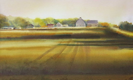
Pioneer Highway The dark shadows were 1) yellows and golds; 2) thalo green & blue; 3) Indian red floated on the bottom.
- Use your sedimentary colors for strong darks, particularly negative painting – wet to dry
- Use your sedimentary colors — floated on after wetting the paper — when you really want to go dark

How Deep?
and stay color-filled.
And all you need are no more than 20 tubes of paint (see last month).
“How Deep” was giving me trouble. You really weren’t zooming in on the sunlight on the girls. I had too much middle value, sun-touched firs in the background. In explaining to another aritst what was bothering me, I knew what I had to do.
I wet the whole sheet again (in a tub of water), let it drip until the drips stop and then floated in great amounts of Ultramarine blue. Still not right. Now it was too blue-green. I blended quinacridone violet into the wet Ultramarine and finished before it dried. I would have had MUD if I had tried to add the violet after the Ultramarine had dried. The gold/green trees did not mix down because they had bonded with the paper and didn’t wash up when the Ultramarine glaze was added.
Hands on? Come to Orcas August 7 & 8!
Happy painting,
Caroline
©2017, Caroline Buchanan
In that Daniel Smith article, Cobalt Green and Teal should be in Sediments. I do not use Indigo, Payne’s Gray, Hooker’s Green. Quin Magenta or Prussian Blue. See my list in the June 2017 Technique Corner.