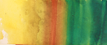
cadmium yellow light under all; then a new layer (right to left) pthalo green, burnt orange, perinone orange, quinacridone gold, green gold and clean water out.
Indian Red over the greens, cerulean blue over the warms
One of the things watercolor does best is to lay color over color only to enhance the original color rather than obscure it. If you didn’t study and work with the November Technique Corner, What About Pigments? I suggest you do that before moving on to this month’s technique. Get to know your stains (dyes), luminous, your bi-functional (dye/luminous), as well as your sedimentary pigments before we take them further.
The examples at the top have cadmium yellow light down first,wet-on-wet, over all. After the yellow was dry, the paper was wet again and the colors listed were added. These are all dye or staining colors and they bonded with the wet paper just as the yellow had.
Howere if I wanted to go darker, another stain would start to obscure the color underneath as it tried to bond with the paper.
Instead, I wet the paper again and added Indian Red and Cerulean Blue (sedimentary pigments) over the colors, reversing the warms and cools to make it easier to demonstrate.
Notice on the left how opaque the Indian red and the cerulean blue appear by themselves. Ugh!
But — and here is the secret — instead of pasting them on dry, they were floated on the paper.
What is floating? It is wetting the paper first (either by brushing or submerging it) and brushing the pigment into the moist paper.
Sedimentary paints separate. Sedimentary — stuff — particulate that floats in water. When you apply it into a wet surface it separates and lets the original hue show through.
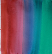
On the right is a second demonstration. Thalo green; thalo green and blue; thalo blue; quinacridone violet, quinacridone red, perinone orange, with some overlaps as shown with the arrows.
Wet it and then brushed Indian Red over the green,
ultramarine violet over the blue,
cerulean blue over the violet,
cobalt green over the red
ultramarine blue over the red going into the orange.
Can you see the lush depth that is acheived? Yet how flat and dull the swatches look on the left.
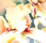
 The next photo shows a closeup of a dark area in a flower painting. This is dark! If you don’t believe me see the black and white of it to the right. But look what an alive dark it is.
There is no such color as orange over green. When you mix orange and green you get brown. When you glaze you get a double color, a chord.
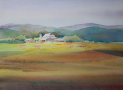
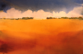
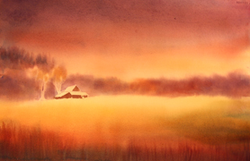
I am sure you can see the immediate application in places such as farm fields — see photos at the bottom.
 Don’t forget skies. I always put down a second, sedimentary layer — wet on wet — over my sky (stains or dyes). Ultramarine blue,cerulean blue, a little violet, a little greem. But you can FLOAT color in a small area too.
Here is a negative painted iris. Got a bit gray and dull in that negative area, didn’t I? But it is dark enough that if I use another dye color it will look dead. Oh my, what to do?
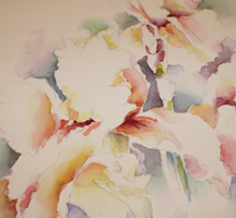
Sedimentary colors gallop in to the rescue! Mainly using cobalt teal, but also some cobalt green and cerulean blue, it is much more alive with a nice rich negative dark.
 Try some on your own. A great way to practice is to get out some paintings that aren’t going to make it, wet them (float them in water) and try differnt sedimentary paints — FLOATING the color onto the paint.
Have fun!
 There is an article I wrote that was published in the 1997 Spring Issue of Inksmith put out by Daniel Smith. I can no longer access it through their archives. If you contact me, I can send you a scan of it.
If it is still a little confusing, contact me about a class that may include this material.
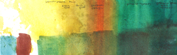
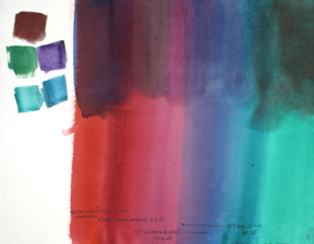
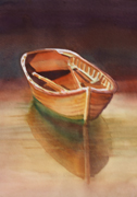
To the left, — all three are demonstrations of the layering technique. Not all finished. Note skies as well as ground (some color is not running true…sorry).
© Caroline Buchanan, 2011