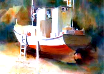
Dreams Abandoned
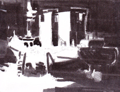
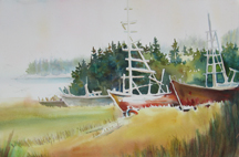
The white shape links ground, ladder and hull, cabin; the darks flow from under the keel, onto the hull, into the background, clasping the boat. The houses that were very prominent on location have been minimized by sharing the same value with their surroundings.
 You have probably been told to do value sketches by one instructor or another. But do you THINK values when you are planning your watercolor? Or are you more interested in “what” you are painting? I claim that the shapes of the values are different from the shapes of the things. It is the shapes of the values, not the things themselves, that are a make-or-break in creating a sucessful painting.
Start with the assumption that your copy — a sketch, a plein air quick painting, a photo — is just a starting place. Now you want to turn it into a painting that is more than just a souvenir. You start refining by organizing your shapes and values.
 Good White Shapes: The white (and light value) shapes tend to be what leads the eye through your painting. Make it an interesting trip.
You start with a white shape, the paper. As you take away from this with paint, what you have left are your whites. Are they where you didn’t paint? Or are they carefully planned. They can be a powerful tool. Rex Brandt used to say, “The question is how do you turn a $3 sheet of paper into a $3000 painting.” The class would laugh. “It is all there,” he would assure us. “The whites and lights are what sell the painting. How you set them up is your work.”
I think of it as a journey you set up for your viewer, like stepping stones across a river. Is the trip exciting? Interesting or challenging? Or are the shapes scattered so that the viewer falls in? Give them a journey that brings them back to the main shape with a smile on their face.
 Good Darks: If the lights lead you through the painting, the darks set them up. Lights should not expand as they go off the paper. Darks can sweep in from off the paper. Think of the letter shapes: C, L and U for your darks, — clasping shapes. I think of them as similar to the tray under the food, a mother’s arms, the backroom politician. May I present ….
It is a good idea to try to do a simplified value study of ONLY lights and darks. It helps you to see your major shapes. Remember: Your focus tends to be where the lightest light and darkest darks come together.
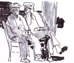
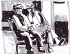

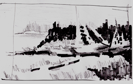
Try a number of value studies different ways until you find an arrangement of shapes you like..
To keep the focus from a competing area, lessen the value contrast. Enter the midtones… the rest of the story. Midtones are the moderators. They move between the darks and lights, slowing down the contrast. They moderate the pace, ease the transitions. Although they play a necessary role similar to the chorus or minor players in theater, they can smother. If you lose your lead and let the midtones take over, you tend to be in trouble. If you have lost your lights, all you can do is go darker in areas. Sometimes this works, particularly if your warm brights are taking the place of the lights. Most of the time, it is flat and boring. It is time to get a fresh sheet of paper and try again. This time stick to your value plan.
How do you get a good plan?
- Start by drawing your shapes, Start with you most important shape, somewhere on your sketch paper (no edges to the design). Keep this plan small, 3-6 inches. Draw the main shape and then find other shapes to help set up the main shape.
- Keep shapes you like. Throw out shapes that don”t tell your story.
- Look for overlaps. Put shapes behind and in front of others.
- Simplify.
- Crop. Draw the borders only now.
 Try several different arrangements.
- Choose the best one.
- When you get a shape arrangement you like, start shading. Go across shapes so the middle value goes on and off objects. As you keep working, begin to darken until you have lights, darks, and midtones.
- Look for lights against darks and darks against lights
- Look for passages of value across different shapes
- Look at the abstract design. Are the shapes of the lights, the midtones, and darks interesting? How can you change things to make them more interesting?
 By now you have probably moved away from your original inspiration. Maybe the sky is smaller, the building bigger with something placed in front of it that is from somewhere else. You have probably thrown “stuff” out. Simplified.
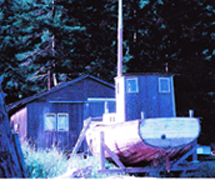
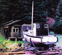
In the examples above you can see how I simplified the buildings behind Dreams Abandoned and chose values are different from the shapes. The first study was more literal to the location. The 2nd, on top, and the 3rd of only 2 values helped me to create a design that led to the painting.
The 4 studies of two Greek men started with a sketch on location. I tried different shape arrangements and have settiled on taking them out of the boxes and doors where they were sitting and placing them under a shade tree near the harbor. I look forward to painting it.
The boats in a picture of boats pulled up and abandoned on Shaw Island were scattered around a field. I first tried them on a gray day and chose a simplified value plan of horizontal bands. The tree line was altered to make the simple dark band, –presenting the boats– and the boats were moved until they overlapped. The center boat was the focal shape.I kept its hull white. The others are light gray. It also has a brighter color than any of the others. Colors and values working together.
 Later I tried the idea again with the stronger values and brighter colors of summer. There is a linked shape of darks — foreground, shadows under the boats and the fir trees. This painting has a totally different feeling.
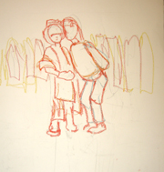
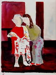
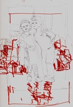
On the right are a series of attempts to capture my granddaughters dressed up. My daughter-in-law makes adorable boutique dresses for little girls and the room behind themand on around a corner was full of her creations as well as bolts of cloth and trim. In the first color/value sketch you see the children with a simplified version of the scene where they stood.
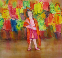
In the second sketch, you see a new design, bringing in a suggestion of the dresses and fabric. I started this one as a painting, shown on the right. Only then did I realize the story was just about the little one who had decked herself out in all sorts of improbable garb. As much as I loved her sister, the older child was simply posing for the camera. The little one had the In Your Face attitude that had captured my fancy. Once I realized this, I was on my way. The final painting is called, What’s a Girl to Wear?
 Who wants to do value studies? I think spontaneous people are attracted to watercolor. We are all so eager to jump in and start painting that we resist taking the time to work on pre-sketches. However those who do tell me that they are amazed how they get INTO their subject. They discover relationships and interest of which they were unaware. They get to know the shapes. They get to know what they want to emphasize, what they want to eliminate. Sometimes their idea takes a whole new direction. Their sense of ownership of the final design — no longer just a copy of a photograph — is reward enough in itself. But a finer, freer painting is the true reward.
We’ll have more about value next month.
Happy painting,
Caroline
©2011, Caroline Buchanan
