 Here is a photo of a Greek fisherman setting his hooks in the mid-day sun in the port of Naousa on Paros. Years after I took the photo, I decided to paint it. At first I was attracted with the movement between the three baskets and the soft light to the sides. After I tried it that way, I found I was more interested in the fisherman and the brilliant sun on his head and shoulders creating a linking shadow aross his legs, the red stool and onto the ground.
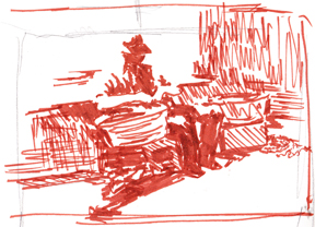 How do you explore this? You start drawing — not complicated drawings but thumbnails trying out different shapes and values. Remember: the shapes of the values different from the shape of the “things.”
In this first one, you can see the lights, darks and midtones. The basket on the wall is missing so that I can create a more flowing white shape between the background, the wall and the light on the fisherman.
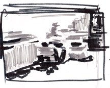 I tried painting this and found the arrangement too static. Here are two more drawings. I kept moving him further and further to our right,
diminishing proportion of the painting on that side — do you see the cropping marks within each drawing? I Also kept pulling toward the top of the painting, elongating a shadow which didn’t exist in the photo.
These are thinking drawings — about 8 inches wide. They are concerned with 3 values. With them I came to the design that you see in the front of the post — a linking white shape that describles brilliant sunshine, a shadowed wall that flows into the cast shadow, under the basket and up the trousers of the fisherman. In this photo the printer may be exagerating the hue 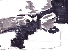 changes in the shadow but also if your values are correct you can do all kinds of things with the hues and still have it read.
This is no longer a copy of a photo I liked but has evolved into a painting. By playing with shapes and values, eliminating things I didn’t care for and focusing on (even exagerating) the aspects that excited me, I came up with my own interpretation.
I will include one one example to help you see how you can start with an idea and a photo and end with a design that reads on the paper and reflects your own personal interpretation.
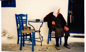
Again, we go back to Greece to this dear little lady on Amorgos who sat by her son’s cafeneon every afternoon, Watching the Crowd Go By. I took a number of photos of her because I found her intriguing.
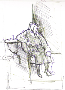 When I started a drawing, I saw right away that if I moved her in fron of the door, I would have an oportunity for lightest light against darkest dark with her head, and then a merge or passage with her scarf against the white wall.
Then there is a value switch with the dark of her sweater against the light of the wall.
When I started drawing the table I decided its thin legs were detracting as were the extra chairs. I substituded a small Greek coffee and a glass of water for the ash tray, letting a middle value shadow under the table move transition into the dark of her skirt and leg until her feet are darks against light.
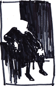
I noticed that the composition was developing into 4 simple off-set rectangles, two light and two dark. In another drawing, I took this further: —
lights against darks becoming darks against lights, becoming darks moving into darks and midtones transitioning.
 I will be looking for a better photograph of the painting than I have tonight. The reds of the sweater were much more muted. The original is in a private collection. In the meantime, you can see get an idea of the painting.

Now it is your turn.
- choose an idea that appeal to you
- start drawing — no borders– from the most important shape, looking for what you want to include
- look for linking lights, darks, and moderating midtones
- eliminate anything that isn’t contributing to what you are trying to say in your painting.
- do several, refining, probably cropping
Think about it. Then all you have to do is draw it up on your watercolor paper, choose colors that will communicate the mood you wish to create, and get busy painting.
Of course, with all that color, you must remember to match the value plan. Can you do that or will the color throw you off?
More about that later!
Happy painting,
Caroline
© Caroline Buchanan, 2011
