How DO YOU choose the color chords for your paintings? Do you just go with the colors in the location, the still-life, etc or do you think about what you want to say and which colors best have that “sound”?
This fall I am going to give you some simple exercises to help “get you out of the box.” I thought I would start with experimenting with color chords.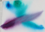
You might want to just wet the pa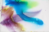 per and take a swipe of a color. Then put another color beside it and let them blend a bit. Then cross them with another. When you get a combination you like set it aside. Or you might want to add a 4th.
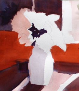
Get another piece of paper and try another, and another. Pin up the ones you like the best.
Or you may want to draw up some small versions of your painting idea and try various combinations. Try ones the scene suggests.
Then try another combination of colors.
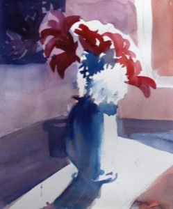
Ask yourself which combination captures the idea you have in mind. Or maybe you discover another combination that surprises you by what it “says.”
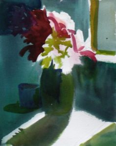
Here are some examples.

Heading Back
In the first man with his mule, Heading Back, I chose a warm chord of colors that reflect late afternoon light, warmth and peace – a quiet, major chord.

Walk to the Far Horizon
In the second, Walk to the Far Horizon, it was more about the color itself but mood has a melancholy to it – a strong, minor chord.
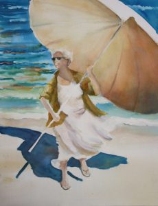
Queen of Crescent Beach
I took several photos of my friend, Joan, taking down the color umbrella she put up at he kayak shop on Crescent Beach. I used one as a basis of Queen of Crescent Beach, when we were studying the work of the Spanish painter, Sorolla. I gave her a white dress to catch the wind and a white umbrella to better explore sunlight. The chord is a happy white, blue, beige.
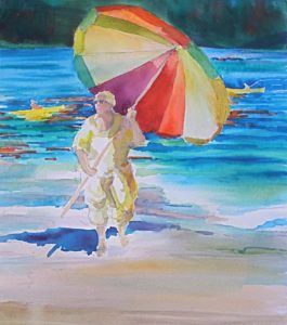 Look at the difference when the white is dropped back and more primary hues are brought in on the second painting.
Or here is another comparison along the same lines — this time of birds of paradise. The one with the expansive use of white paper feels more like the flowers are in bright sunlight. The one with the dark greens, deeper versions of all the hues suggests the tropical nature of the plants. 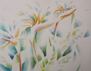
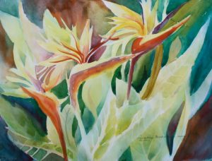
But the birds of paradise are exploring a very similar palette… perhaps it is the difference between light, high instruments, and bassoons, cellos, and bases.
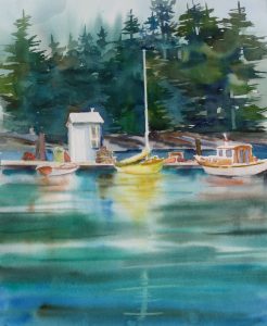
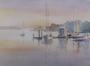
Another example of the same subject (not same drawing) with very different chords and moods:
The first study is “as is” colors, a major chord, straightforward.
But if we shift the scene to the muted pink, lavender and gold chord and we generate an entirely different feel – a gentle, reflective “sound.”
The first painting of the barn, Skagit Farm, was painted from an ink sketch done on location.The painting is nothing like the brilliant summer sun on the day I made the sketch. These colors are a chord or harmony that pleased me on the day I painted it. We can choose where we want to go with our subject matter.
 I hope you experiment with colors and come up with some
  chords that you find particularly pleasing. Save the examples that are particularly pleasing.
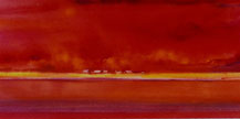
When you choose a subject to paint, feel free to choose chords that combine colors that are a pleasure in the colors themselves or that capture the mood you wish to express.Let your experiments with color chords free you from a literal interpretation of your idea.
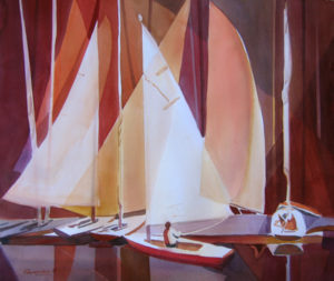 Think in terms of color chords to get the harmonies you wish. Have fun with your experiments. I hope you come up with new and beloved ideas.
Caroline
