How do you know if you have good design? You were introduced to value plans last month. Here are a few more techniques.
Practice Black-White (2 value) Drawings
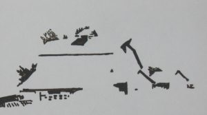
Let’s assume you see a barn similar to the one above and you want to sketch it for a painting. Instead of doing a shaded drawing,try reducing the scene to a black and white using only a felt-tipped marker. Try it with this photo.
You will want to alter some of the arrangements. I would suggest picking up the barn and putting it in front of the edge of the shed and to the right of the shed instead of on the left. Always be looking for ways to have the shapes overlap. Then look for darks against lights and lights against darks to tell your story. You may decide to discard the shapes of the range of mountains and just use the dark of the tree band. Are you going to include the shadow on the grass to the left?
Notice how, on the one directly below,

- I “borrowed” some trees to tell the viewer where 3 corners of roofs are.
- Values flow into each other and we don’t need lines to explain: front of the nearest building slides into its roof and on to the face of the large barn. The white shape continues into two roof planes and on into the sky, yet you can “see” them all as separate shapes.
- The lights-against-darks of the fence become darks against lights.
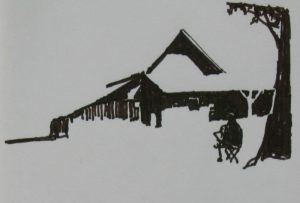
Here is another example:

Notice how important the little bit of light on the top of the artist’s head is; how you understand the volume of the building without the back side of the roof.
As you drop out the midtones, you begin to appreciate the design of the values and how important they are to your painting’s design. You can’t do too many of these — looking for lights against darks that become darks against lights, looking for the values that explain.
Reduce your Idea to Three Values
Let’s add a third value. When you are given a mid-tone after you have been working with the felt markers you feel you have so much more choice. Is it as good?
This exercise will help you with seeing the design of the mid-tones, the most difficult value to see as shapes on the 2-dimensional paper.

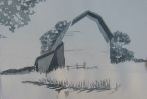
Here is a possible subject. How would you design it? For this exercise, instead of using markers, we made a large puddle of a middle gray (I mix a blue and an orange) and paint it over everywhere we don’t want to leave the paper white. 
When that is dry, using the same puddle, paint everything you want dark. In this example, the shadow under the eves, the cast shadow on the left wall, cast shadows of the grass, distant trees.
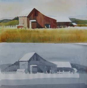
And here is the painting in which I tried to follow my value design with color. I did lower the value of the sky a half-step with color.

Here is another example of the 3-step gray painting with large simplified values and the color painting that tries to match those values.
These two exercises will help you see your value patterns clearly so that when you move into color you can get the VALUE of the color correct. Planning interesting shapes of lights, mid-tones, and darks, and painting the correct value of the colors you choose are two major ways you can create paintings that please you.
Happy painting,
Caroline
This is the 3rd in the series of mantras, or techniques/approaches I expect to find in the watercolors of artists who have studied with me. See March and April’. There is more to come.
