 Going the short way, you can put down all of the colors again in narrower stripes. Or you can just try your staining colors, crossing the other bands — be sure to label them. You can use tape between the lines or do them free hand. You can dry them between bands or let them run into each other.
On another sheet repeat the same 20 colors and cross them with you sedimentary colors.
Or you can just play…. On the left is a sample using only cadmium yellow light, pthalo blue, alizarin crimson. Darker or stronger puddles of paint were used for the top bands, lighter ones on the bottom.
Where it is gray you know there is red-yellow-blue, equal amounts. How wide is the red band on top? How wide the yellow? How about the red-yellow-blue bands on the bottom? Hint: there are two bands of yellow, overlapping. Each of these were dried between applications and tape was used.
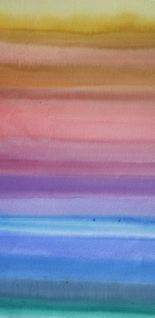 On the right are all the colors on my palette. I put down horizontal wet-on-wet stripes from yellow on the top through the reds, violets, blues and into the greens. When the sheet was dry, I rewet it and moved just one step over on my palette (which is arranged like a color wheel), overlapping quinacridone gold on the yellow, perinone orange over part of the quin. gold, quin. burnt orange over the orange and on around. It shows the vibrancy of overlapping glazes of slightly different hues.
One of my students wrote to me last spring saying she was going to get “an up close and personal relationship with her colors.” She started with her yellows, blending each with all of her blues:
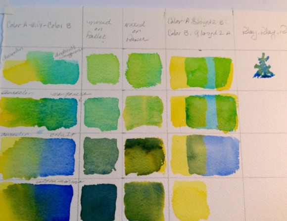
Across the top of her matrix she has:
- Color A and Color B – these were labeled so that, for example in the first row, she had aurolean yellow and cobalt blue – a swatch of each, side by side and blended together in the middle
- Colors A & B mixed together on the palette
- Colors A & B mixed together on the page
- Two squares of A painted and dried – a small space between them and dried. Then B, the second color, painted across the two squares leaving in this case pure yellow on the outer edges, green on the overlapping sections, blue showing between the two squares.
- Her last matrix box was labeled “play” and there is random charging of the one color into the other.
A really ambitious project but when I last saw it, she was getting spectacular results. Try it! I haven’t yet, but if you don’t hear from me again…..
Or, here is another way to get to know your colors:

Divide a half sheet into 4 or 6 rectangles, using masking tape to separate the rectangles. Draw up a simple scene again and again on the rectangles. Then experiment with different colors. Using a first color in all of the boxes. See what happens when you change the next layer.
In the example above the 4 rectangles were wet all at one time and a wet-on-wet sky was blocked in with pthalo blue mixed with a little thalo green on all four (box 1). The foreground received the same band of cadmium yellow pale (box 3).
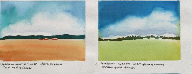
The four were wet again. On the first the sky was left as it was. The foreground was glazed with cadmium red medium, over the yellow. On the second, the yellow was overglazed with green gold. The new sky layer on the second was cerulean and ultramarine blue. White distant mountains were negative painted out with a mixed gray-violet, dissolved into clean water. Dark hills were added when the paper was dry, negative painting around the shapes of buildings. Then the building walls were painted with a quick stroke of red.
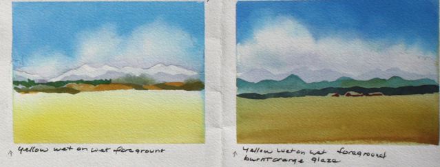
The third one shows the yellow band unchanged, while the sky received a second wet-on-wet glaze of cobalt blue. Mountains and hills are different. The four has a burnt orange glaze over the foreground and a stronger amount of cobalt blue (cf. to #3) over the first glaze of thalos.
There are more suggestions for exploring your colors but I better save them until next time. These will certainly get you going on those days when you want to paint but aren’t quite sure of what to paint.
Have fun!
Caroline Buchanan
© 2015, Caroline Buchanan
