I had a request for something on composition so this month we will start with some guidelines.
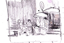
Take a moment to compare the origianl photo and the final painting of the Tourist Girlfriend. Value sketch #1 is above. Follow the thinking revealed in the next three as you read the discussion below.
What is your painting about?
That isn’t as simple a question as it looks. Usually the first answer is a generic label: it is about flowers, or the bridge over the river, or my granddaughter putting on her shoes.
What ABOUT that subject? What do you want to say?
Flowers – light bright splashy? or sunlight on a lily? tulips in a field, the essence of a spring day?
The bridge over the river — could be about the peacefulness of the river; or the majesty of the bridge high overhead; or…? Why do you like it?
The granddaughter – how do you get beyond the fondness you have for the granddaughter and find the painting?
Your language
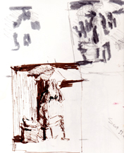
 In this photo of my grandson, I thought I loved the whole thing (typical). In the first version, I was particularly taken with the long shadow and tried that.
You communicate your message with SHAPES, VALUES, and COLORS. If a sentence has a subject and predicate, then any and all paintings are composed of shapes, values and colors. Your job is to choose the shapes (including negative shapes), values and colors that communicate how you FEEL about the subject.
 If you think of shapes, values and colors as your (3 part) subject and predicate, you can add line and texture as adjectives and adverbs. The painting is more sparse and direct without them. Used sparingly, they can enhance the subject. Too much can quickly detract from what you are trying to say. If you use a lot of texture, you probably want to key down your colors.
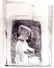
Next, in the project of my grandson, I tried a study emphasizing the gifts. It didn’t interest me.
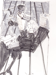
Through this work, I realized that the key was his trembling delight with the new gift. I liked the balloon but it was too far away. The final painting, The New Gift, at the bottom.
Your focus or main form:
- Know what it is
- Work out the journey through your painting that leads the viewer to this form
- Make sure we end up there by any or all of the following –
 lightest light against darkest dark
- brightest version of a color that you have used elsewhere
- or a color that appears no where else in the painting
- If you have diagonals in the painting, the strongest diagonal needs to point to or lead through the focus
- a shape that doesn’t occur elsewhere – i.e. the only circle in a basically rectangular composition or a large shape where all the others are small, an organic form when everything else is man-made rectangles etc.
- After that you have a number of relative choices:
- hard edges beat soft edges
- bright colors beat dull
- warm colors beat cool
- high value contrast beats close value contrast
- singular beats repetition
How do you work this out? Start drawing!
You can’t do too many studies.
- Start by drawing your focal shape in the middle of your sketch paper, not too large.
- Look for overlaps and underlaps… tuck those daisies behind; bend them this way and that
- Make sure each of those shapes are contributing…. do you really want the vase and the table? Why? If you put a boat in the river below the bridge, how is it leading us to the bridge? Does the overlap the bridge or bring the eye to the bridge? Do you really want the swingset behind your granddaughter? How does it tell the story of her putting on her shoes?
- After you have the shapes the way you like it, draw a box around the strongest part? Horizontal, or vertical? How much should you crop in? How is the negative area contributing
- Once you have the shapes the way you like them you may want to make a photo copy of the line drawing.
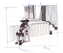
- Try different kinds of value plans.
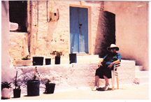
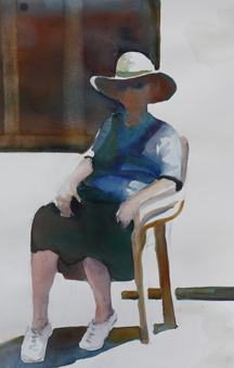
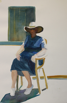
The lady sitting in the sun started with two earlier value plans and one “draft” painting. After having drawn her about 5 times, I photocopied a line drawing and tried some different
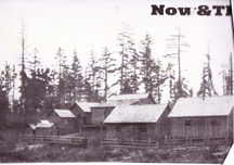 Here I was taken by the roof line in the photo — didn’t care for the trees, See first value sketch.
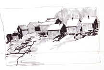
I began to imagine a cliff dropping off (2) and perhaps rising above it. Tried two draft paintings. The one at the bottom is almost done. Far from the Seattle early loggers’ cabins, it has moved to a windswept imagined cliff, perhaps out of Babette’s Feast.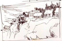
Value plans (can be about 2x 3 inches):
- Try more than one way
- The eye moves through on the lights shapes
- The darks set up the lights
- Mid tone areas gradate from light to dark
- Consider and shade the unimportant areas — they are the make-or-breaks
- Once you have one you like make an abstract of it — the shape(s) of the lights, of the darks and the midtones with no “things”
If you don’t like it, change it
Further considerations:
- Have a main form or focus with the other shapes leading to it and setting it up; think of it as your “star”
- You can have 2 more – no more than 5 secondary shapes, supporting actors
- Anything else is chorus
You are in the director’s seat. You chose your lead, your supporting actors and the chorus. They need to all work together to create a whole — your painting. As Rex Brandt used to say: “The only ‘single thing’ in your painting is the painting itself.Everything else is contributing to that painting.”
You are the director…. you choose your lead — because of what interests YOU or excites YOU. You choose every thing else to help others feel what you feel about that subject. Your tools are shapes, values, and colors.
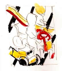
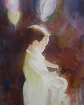 The New Gift
Noontime at Korali’s — first version I felt the window was too large. Second one chanfes the shape and temperature of the window.
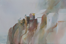
A draft of the buildings. I felt the building line was too horizontal.
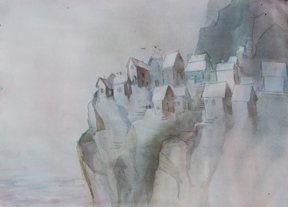
In the second one, I moved buildings up and down the cliff and tipped them into the weather.
Happy painting,
Caroline
©2012, Caroline Buchanan