Are you one of the people who are afraid of pthalo green and pthalo blue? If so, it is time to face your fear and welcome them on your palette.
As I write, my eye catches the header strip on my home page. There you have it – pthalo green and blue. Strong and vibrant, easily developed into all the shades of green or blue we see in the natural world.
Perhaps it is because they are called STAINS. We have a lifetime of trying to avoid stains and remove them when they occur. Let’s call them DYES. They go on easily, flow with the water making wonderful adjustments as they intermingle with other pigments, can be removed during the wet-on-wet stage if they wander into the wrong area, just a thirsy brush picks them up, and seep into the fabric of the paper (Arches is the best) to stay as they dry.
Because this is a technique corner, I am relegating the background to the end of the article. Let’s get started exploring these “frightening” pigments.
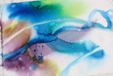
Exercise 1: The pthalos flow with water and interact seamlessly with other pigments
 Wet a sheet of paper by soaking it in water. You can brush it or sponge it but that takes so long, why not immerse it in a sink or a couple of inches of water in the bath tub?
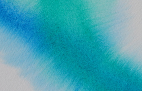
Now put on a big swash of thalo blue and, another of thalo green one under the other….
 Take another dye color — such as your violet (quinacridone violet here) — and stroke through both of the other bands.
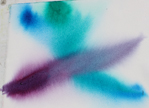 Hold you paper up and let the violets flow into the blue and green and the blues and greens flow into each other
Turn it upside down so they flow the other way
Add some yellow near the green and some yellow near the violet
Cut through both yellows with your (perinone) orange
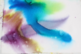 Pick the paper up and hold it so the color blend
Did they run into each other almost washing the other pigment away? Then do another group of strokes into the page with less water on your brush compared to the amount of pigment. Pick it up, rotate it.
Did they stay put and not run at all? Not enough water. Try picking up your paint with more water on your brush and brushing it through some of the color.
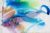
- Look at the paper, hold your head at an angle. Is the shine going off? Time to sprinkle some color on the area,or some clear water. I like to use an old tooth brush and just run my thumb along the bristles to make the splatter.
- Take your flat brush, rinse it and blot. Then draw through the damp areas, lifting up the “stains” and leaving a clear area.
Stop! Set the damp paper aside to dry completely before you do anything else on it. Cardinal rule: when the shine goes off you MUST stop adding water and paint.
When the paper is dry, the colors will be lighter. This is because they have soaked into the fabric of the paper. It is dyed. You can count on this color remaining there, not dissolving and turning to mud as you add further layers.
Remember you dyes (or stains) spread easily, mix with other pigments seamlessly, and bond with the paper, giving a strong underlayer to your painting. See the paintings at the bottom of this post of the sky washes.
Exercise 2: 24 hours of green.
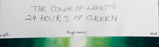
On dry paper, make a box out of masking tape. Mine is about an inch high and 24 inces long.
Wet the whole strip
- working out from the middle (skip an inch) go from lighter to darker thalo green
- in the lightest area add a little bit of yellow or green gold to make the light green on the yellow side ( 10 and 11 am; 1 and 2 pm)
- increase the saturation of thalo green as you move toward 3-4 in the afternoon and 8-9 in the morning; drop out the yellow
- full saturation pthalo at 7 and 5
- 6 in the morning and 6 in the evening start adding pthalo blue to the pthalo green
- increase the saturation of the blue and green and as you retreat into full night add your violet to the mixture until you have a very very dark green.
This is how the hue itself changes in light.
Exercise 3: Mixing Pthalo green with all of your hues
The hue pthalo green (blue shade) is a grand color because of its clarity and strength, and because it is exactly halfway on the color wheel between yellow and blue. However its occurance in nature is not all that frequent. Adjust it — as nature does — a little more yellow here, a little bluer there, but how about a little orange? Or red, or violet?
On the left are all of the colors of my palette arranged in a wheel.
In the center is a circle of pthalo green (Daniel Smith, blue shade). In between are the greens I got when I made a wet circle of the pthalo green and mixed each of my pigments into the thalo green — cooler greens, warmer greens, blacker greens.
Lighter versions in individual patches are the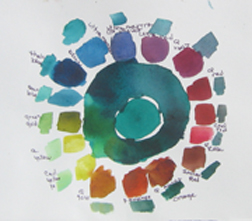 furtherst circle out.
Try it with your palette’s pigments and your staining green (hopefully pthalo).
Try it with some of your other colors too if you are trying to learn your color mixes.
Don’t be afraid of pthalo green (or blue) because it is too “strong” or not what you see in nature. Use it as your base and take it from there.
 Exercise 4: The greens of nature – all from one green
My granddaughters and I recently completed a puzzle of a Gaugain painting. After fitting all his various hues of green together, our eyes seemed reopened to the variety of greens there are in nature.He was constantly shifting the hues. That is what we all should be doing.
- Make a small wet puddle and add green, then add one of your other hues.
- Keep going, adding green, adding each of your pigments, adding water as needed. But keep it green!
- Blue green, blackened green (reds) yellow greens.
- Every once in a while let a piece of the color you are mixing show.
- How lively! How much like nature.
We will look, in other technique corners, how the dyes make a strong base. You can review this in the posts of 10/10 and 01/11.
What they don’t do well is glaze over another dye in a strong saturation. If you were to glaze over the green exercise #4 with alizeran crimson, you would hate it! That is when we use the sedimentary colors.
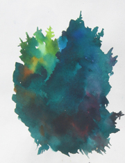
 But when you want a good, alive dark — go for it with the stain. In the Slickers on the Line that started this post, I wanted that dark of the door, right next to the white of the lit slicker. I wet the area, really SATURATED it with pthalo blue with some violet and gree added, and toward the bottom added some burnt orange for a little warmth. One shot.
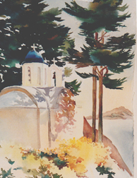
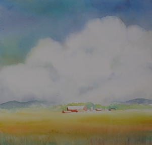
The same with the rich greens in the painting on the right. They were done much as exercise #4, started wet-on wet and then developed with wet blending. The dome, is pthalo blue white, to pale to full saturation.
While we are surrounded with greens — get out and paint them. You don’t need a lot of greens, or blues… just your two pthalos and you can make all the sky colors and foliage colors you see as you mix and adjust with your other hues. We need these base colors.
 BACKGROUND: The pthalos, along with alizeran crimson, and a host of other clear pigments were labeled as stains by Barse Miller, who taught a masters class on watercolor in the 1970’s. Christopher Schink, who studied with Miller, developed a clear presentation of Miller’s pigment groups in his Mastering Color and Design in Watercolor, 1981. This wildly successful book, as well as Jean Dobie’s (another Miller student) Making Color Sing, 1986, made the Miller groupings de riguer in the language of pigments.
 However with the development in the 80’s of the new pigments, led by Daniel Smith’s chemist, Ron, the classification of stain lost some of its pejorative meaning. The new quinacridones, perinone orange, green gold, all DYE the paper. They don’t have the masking quality that occurs with a heavy application of stain over dried stain late in the painting. You can use them any time.
 So why trumpet the pthalos? For their strength and their dead-on hue. Let’s call them DYES and use them much as you do a good stock in your cooking.
Happy painting,
Caroline
©2012 Caroline Buchanan