If you have followed parts I and II of the value discussion, you probably realize these discussions could have as easily been titled: Designing your Paintings.
The shapes of the big patterns of lights and darks (as they go on and off the objects) are more important than the shapes of the objects. Look for them. Design them. Make them happen in new and exciting ways. Make them happen in ways that express your intent or content.
But what about color?
Color is the rest of your life!
Why do I say that?
 Most of the people who take my classes say that they Love Color. They are attracted to watercolor because of the color. Understanding the roles color can play in your work can keep you (happily) occuppied the rest of your life.
Many new students come to class, loving color but drowning their paintings in mid-tones. Loving color, they jump right in. They haven’t learned to plan for and save white and light areas. They don’t know how to get color-filled darks and are afraid of trying to achieve them.
Mantra: The more you love color the more you need to understand value.
We are going to start picking apart the complex relationship of value to color in this month’s discussion. We need to train your eye to see the VALUE in your colors.
As a color comes, full satuaration, out of the tube some colors are naturally light. Some are dark. Hues are “born” with their values as part of their DNA –same as the color of your eyes.
Do you know which are your lighter and which are your darker pigments?
 Exercise one:
Make a circle or a square of each of the colors on your palette, full strength. After the patches are dry, cut each of them out and arrange them — lightest to darkest. If you think two are the same, put them on the same line.
There is no example of this exercise here because YOU need to figure it out!
After you finish, either take a photograph of your arrangement and put it into a black/white mode, or make a black and white print of it on your photocopier.
Compare: Did you make any mistakes? If so, rearrange the colors untilt you have a scale of the lightest, middle,light, darker, and darkest hues on your palette.
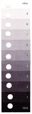
Aid: You can check the values of your colors any time you are working by using a gray scale similar to the one on the left. Eiither print this gray scale or make yourself one. With a paper punch, punch a hole in each value. Hold it over your swatches of color and see what value each is. Compare it to your value study. See if you can see the value in the color.
The value of colors are like voices. Which are your soprano colors? Altos? Tenors? Baritones?
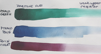
baritone hues — darker to lighter > just add water
Getting a color (hue) lighter or darker: When you choose the color with which you are going to paint next, you are choosing a place on the color wheel, say violet. It is easy to get it lighter — all you do is add water. Dilute it.
To get it darker, get more pigment on your brush. Load up your brush until the pigment and water saturate it. That will give you the value as it comes out of the tuble. To go darker than that value, you also change the hue. We will save that aspect of color/value for another discussion.
A CHALLENGE: Can you SEE to keep the values the same, can you physically move to paint to keep them the same:
- as you change from one hue to another
- as you change from a purer (more intense) to a duller version of that hue
- as you move from a warmer to a cooler version of that hue.
In every instance, the VALUE must remain the same.
Exercise two:
- On your watercolor paper (Arches please), make 3 boxes with masking tape so they enclose areas about an inch wide and three inches long
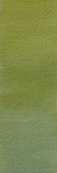
- label the first one: SAME VALUE – changing hue
- Put a different color at each end — but the VALUES of the two colors must be the same (hint — you must lighten the darker one to match the lighter one);
- Stroke them toward each other, adding paint as necessary until you get the same value as the hues change to the mix of the two in the middle.
- If you don’t get it, try it again!
- Squint to see if you did it.


From one hue to the other — keeping the values the same
Exercise three:
2nd: label Same Value, Same Hue, change in temperature
- Wet the shape of your second taped rectangle — watch the amount of water — neither too wet so it puddles, nor too dry so you can’t move the color around
- choose your color and put it in the middle, brushing it toward the ends
- Add the next color on the color wheel to it on one side (orange next to red or blue next to green) and brush them together; not so much that it no longer is a red or a green; if it becoms an orange or a blue, it is too much.
- Also add the color on the other side of the color wheel to the main hue — red to red violet; green to yellow green
- Keep the value the same
- Stop before it gets too dry
- Do it again if you didn’t get it right


Changing temperature — warmer to cooler — keeping the values the same
Exercise four:
3rd: label Same Value, Same Hue, change in intensity (bright to dull)
- Wet the shape of your third taped rectangle — watch the amount of water — neither too wet so it puddles, nor too dry so you can’t move the color around
- Choose your color and put it at one end.
- Brush it toward the other end but get lighter toward the 2nd end
- Add the compliment to your chosen hue — or another way of thinking of it: if you have a primary as your chosen hue, add a mix of the other two primaries; if you have a secondary, add the 3rd primary
- Brush the compliment into the orriginal color, being sure that you don’t go all the way to neutral but end up with a duller version of your original hue
- Keep the value the same
- Stop before it gets too dry
- Do it again if you didn’t get it right


Changing Intensity — brightness to dullness– keeping the values the same
If you can see the VALUE in your colors you can paint them correctly AND if your values are right, you can do all kinds of wild and wonderful things with color and still have your design read. For example:
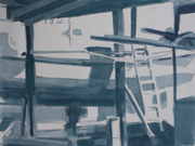
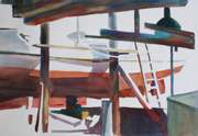
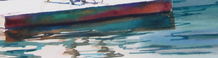
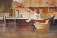
Here is the value plan of a boatworks, and the painting from the plan on the right. The values are the same but throughout the painting the hues keep changing, giving life to the different areas.
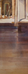
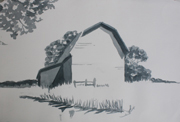
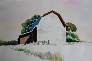
Again a value plan and a demo of the concept of: If your values are right your colors can vary within the values (never got the near tree in). In the image above you probably can’t see some of the variety in the darks:
Even this close up doesn’t get them all but you can see how it isn’t just one blue or just one red.
Learn to see the value of your colors. The better you are at your values, the more color-filled your paintings can be.
Happy painting,
Caroline
© 2012, Caroline Buchanan