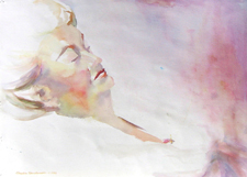
Ida, painted in “transparents,” 1983
About thirty years ago the watercolor world began to talk about pigments as Transparent, Staining and Opaque. At that time the thinking was — you choose your subject and then choose your pigment grouping: transparent for delicate subjects, stains for bold, opaque for earthy. What seemed to happen in practice was that artists came to prefer one grouping over the others.
Jeanne Dobie made an excellent case for the “transparents.” Christopher Schink preferred the “opaques.” Each won converts from those who read their books and tried to paint as they did. Richard Nelson used only the “stains,” — no book.
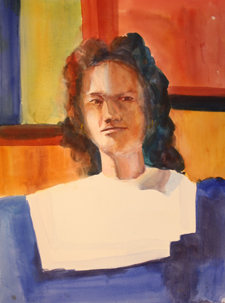 In 1980 and 1981, I studied with Richard Nelson and used only the staining primaries — pthalo blue, alizarin crimson, and cadmium yellow pale — for about two years, Shortly afterwards, I took a workshop with Christopher Schink where painted an old cowboy one day in the earthy opaques, a biker in bright stains and one day we painted an ancient woman with flaming bottle-dyed hair and the delicate skin of a true redhead with the transparents. The next day we painted in the shadow shapes on a woman with cobalt blue. Then we were to glaze over those with the skin tones. My cobalt shadows started dissolving on me. It looked like she had developed skin lesions. “Oh,” I cried. “If only I had used stains first. Then the shadows would stay put.”
Here is a photo of her. You can see how her nose traveled west as I chased the dissolving shadow; her jaw has a raw edge. In the background, I started experimenting with my new theory of putting thre stains down first and glazing over them with the sedimentaries (opaques).
 I developed this approach into what I called “intelligent choices.” There are no BAD pigments. There are just right and wrong times to use them. In the course of teaching and writing about them, I have helped to change the language of pigments.
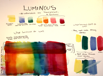
I objected to “transparents” because all watercolor is transparent. So what did aureolin, cobalt blue, rose madder genuine or late quinacridone rose, and viridian do that was different? They let the under color show through, changed by the filter of their color almost the way a color film placed over a spotlight alters the colors on stage. They alter without calling attention to themselves: they are LUMINOUS.
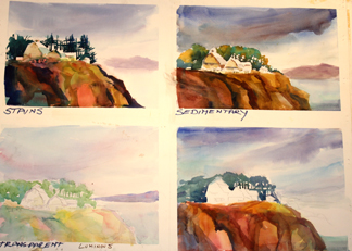
The “opaques” are very opaque if you brush them on thickly without much water. How many of you have done that with Indian Red, or Cerulean or Yellow Ochre — and banished them? But have you tried them floated over another color? You wet the area and brush them on, tip the paper, float them across the surface. They are SEDIMENTARY and the sediment separates, laying on the top of the paper which the under color flickers through. I use them for unifying glazes, for giving depth. Never opaque.
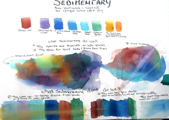
Stop now and get some old dark hated painting. Wet it — might as well just submerge it in some water in a sink. Pick it up and let it drip. Then put it down on a board with an angle (15 degrees) and brush on your sedimentary colors — float them (brush gently), encourage them to flow. Try cerulean blue over a red or a warm area. Try Indian Red over a green; try Ultramarine Blue over the green. Also try some aureolean and see the difference.
Each has its place.
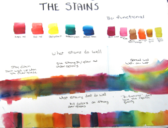
What about the “stains”? First, let’s change this name too. A stain is pejorative. We don’t like them. We buy all kinds of products to try to remove them. They are DYES. They soak into the fabric of the paper and, after they are dry, they stay where you put them so you can paint on top of them. They flow easily so, in that first wash you can brush them across a big area, get one hue to blend easily into its neighbor, create wonderful shifts of color into color — sometime watercolor does much more effortlessly than other mediums.
An article I wrote separating the pigments into “intelligent choices” was published in Inksmith in spring of 1997 by Daniel Smith Inc. They tell me it was one of the most popular articles they ever ran. It led to them packaging my “palette” of 20 colors. I would still abide by most of therm. There is a link to the ’97 article in the About Caroline section of this website. (I am not able to reproduce the link here)
Following the article the list of pigments they inserted is wrong. Here are the correct pigments that I use.
Staining (Dye) Color Choices:
Quinacridone Red or Anthraquinoid Red or
Cadmium Red medium
Perinone Orange
Cadmium Yellow Light (Hansa is okay)
Rich Green Gold
Thalo Green
Thalo Blue
 Bi-functional (dye and luminous):
Quinacridone Gold
Quinacridone Burnt Orange
Quinacridone Rose
Quinacridone Red
Quinacridone Violet
Perinone Orange
Rich Green Gold
Luminous Choices:
Aureolin (Cobalt Yellow)
Cobalt Blue
Viridian Green
Sedimentary Color Choices:
Indian Red
Ultramarine Violet
Ultramarine Blue
Cerulean Blue
Cobalt Green
Cobalt Teal
plus any earth pigments you enjoy!
Almost 30 years later I am still experimenting and expanding how to use pigments. The simple rules:
DYES (stains) are: powerful and intense. They mix well. They flow and blend with other colors on the paper easily. They stay down and bond with the paper after they dry and, although you can lift them while they are wet, it is more difficult later. Negative: in strong saturations, they “kill” the color they are glazed over making an ugly dark.
SEDIMENTARY pigments make beautiful overglazes, letting undercolors sparkle through. Add a certain depth and texture to the paint. Negatives: not wise to use in first washes as they will dissolve in later work and “make mud.”
LUMINOUS: beautiful late glazes without calling attention to themselves. Very good for subtle work such as orchids, baby’s skin, etc. Negative: wimpy.
Add your favorites to the groupings so you know what they are and when to use them.
For an experiment:
- Make a swatch of your strongest red – about 2 inches wide and 8 inches long
- Swatch #2 same size of a strong yellow
- Swatch #3 same with your orange
- Swatch #4 of a sedimentary color you have
Dry them
- Then mix a small dark puddle of pthalo blue and make a 1 -2 inch wide strip across each of the swatches
- Mix a similar puddle of cerulean blue or ultramarine blue and do the same thing
- Then do the same with any other blues you own.
Conclusions?
- With a strong stain, across a strong stain: the top one tends to mask the color underneath
- A sedimentary color across a strong stain lets the under color show through
- A sedimentary color down first, tends to wash up when it is glazed over with another color
- (add more)
You might want to make a matrix of your palette, labeling which are dyes, etc. — do all the colors in 2 inch swatches, left to right. After they are dry, repeat top to bottom.
More in a later column. In the meantime, have fun learning about your pigment choices.
Next month we will be painting snow.
© 2010 Caroline Buchanan