A Movable Feast, Caroline Buchanan
How much do you think about designing for the flat of the paper? Most of us have spent a great deal of effort learning how to make things appear to be 3-dimensional in our art work. However, no matter how well we create the illusion of believable space, we greatly improve our painting if we also design for the two dimensional surface of the paper.
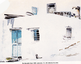
But first, take a look at the painting above, A Movable Feast, as it appeared in an American Artist Magazine article Less is More, 1997.
You are looking at a flat piece of white paper with some trapezoidal shapes scattered over it. Nowhere in this painting did I draw the edge of the wall. But you SEE 4 walls and a walkway because of the implied perspective in those trapezoids. Do you find it impossible to see the flat of the paper?
We commonly show depth on a two dimensional surface by some combination of :
- scale — same shapes are larger forward and smaller back
- overlap — telling us what is in front and what is behind
- perspective — organized recessional movement toward the horizon
- modeling — lighter toward the light source, darker in shade
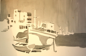 The study of the Aigaili harbor in monochrome can be appreciated both as a 2-dimensional design and as the implied 3-dimensional harbor. Take a moment to look at the interlocking white shape, the middle grays, and mostly scattered small darks. Notice how the darker water pushes the large boat toward us. Aigaili Harbor, value study
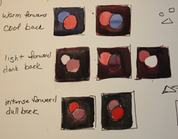
What happens when we turn to color? Here is a chart to remind you that:
- warms come forward, cools recede
- light comes forward, darks recede
- intense colors come forward, dulls recede
 In the painting to the right, the exercise was to paint color change, keeping the values the same. There is a clear pattern of white
 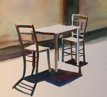 shapes and of linking darks, plus a play of lights against darks and darks against lights. There is a believeable 3-dimensional implied space and a fairly interesting 2-dimensional painting.
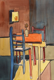 Now take the same scene and try to break the rules listed above, trying to NOT imply 3-dimensions? In the study to the left, the grouping is turned parallel to the picture plane (less sense of space). Recession is violated by the table top, yellow-chair bottom, the yellow floor trapezoid. Yet arbitrarily the seat of the blue chair is in perspective. The bottoms of its legs are not. The pattern of yellows on the 2-dimensional surface are just that – pattern. You can’t quite get the floor to lie down, nor the warm wall to stay farther back than the cool one. Is the center of interest the flower and vase on the orange table or the one on the far wall?
Is this a mindless exercise? I don’t think so. Try one like it. Use as may “rule breakers” as you can. Paint each shape flat with no modeling. Do you see how it makes you THINK about which color to use — how light, dark, warm, cool, bright, dull? How each relates to the others?
Next, take an idea for a painting and try designing it with linking lights, midtones and darks. Look for the links even if you have shapes that imply space and recession.
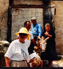 For example, look at the following two photos:
Each is a “stack” of people — overlapping shapes, larger forward, smaller in the rear. But note how the red shirt comes forward and beats out (or competes with) the forward figure in the right photo and how the blue shirt’s intensity rivals the forward figure for point of focus in the left photo. Both designs could be made much stronger.
How could you design the left one so that the man on the donkey was the focus for sure? Try it and then design it so the woman in the hat is the focus? Try it with flat values first,– maybe change the values of the wall on the right, making less contrast there. Try unifying the values on the man on the donkey if you want the woman to be the focus. Make her shirt t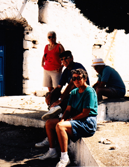 he value of her shorts if you want the man to be the focus. Have a drawing that is a pleasing 2-dimensional design. Do you want to get rid of the box rectangle above the doorway? What else will make it stronger? Then do a flat shape painting trying different colors. Look for links in hues just as you had links in value.
How about the photo on the right? Have you decided that the 3 strong dark areas are too dark? What if you make the negative area of the background less intrusive? What about the man between the red shirt and the teal shirt? How about putting him in a shirt the same value as the red, but a rosy violet? Do the figures link better? How about the white sneakers? Do you see your way to a stronger design? Do some value studies and color plans to see what you get.
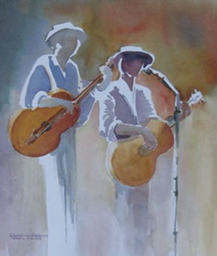 For an example of a painting in which both the two-dimensional design and the implied 3-dimensional design are apparent, look at Two Guys Named Moe. This painting was developed from sketches I did at a live Dixieland performance. The challenge I gave myself was to have a unified background of the same value while shifting hue as it rolled from right to left. That same value shape continues without an edge up and under the brim of the hat and on down the face and neck of the musican on the left. In addition, while the background is the same value (changing color) across the top, the hue stays the same it goes from the top of the painting to the bottom while the value gets lighter and lighter until it fuses with the lit portions of the figures.
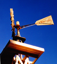 Now try to move on from your studies to a painting. You may want to use the figures in the photos above. Keep them simple — see them as shapes of value. Or, if you prefer not to use people, here is a windmill that implies strong 3-dimensional recession. Think about the list of what goes forward and what goes back on the 2-dimensional plane and see if you can make an interesting pattern on the paper. As you try making different shapes warmer or cooler or lighter, or darker, brighter, duller, see if you don’t become more aware of how you can
 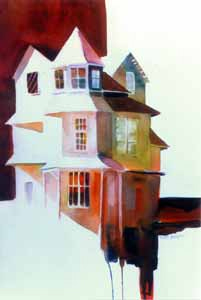 make your painting as handsome on it’s 2-dimensional surface as it is in implying a 3-dimensional representation. It is a better painting, isn’t it?
Remember, the sky doesn’t always have to be blue. Nor is white always white.
Victorian Gentleman Awaits Interested Party
Happy painting,
Caroline
©Caroline Buchanan, 2010