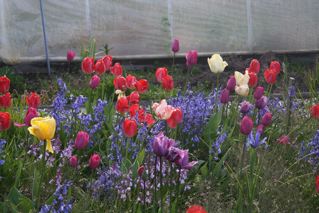
Who is the scene stealer in this photo? The yellow one, right? Imagine these flowers are a choral group. Greens and some violets are bass. The blues and other violets are baritones. The reds are tenors and altos. The whites, pinks, and yellow are the sopranos. All of the voices blend except for that soprano on the left who voice cuts through the others and shatters glass.
Yellow has everything going for it.
In value it is way lighter than any of the other colors.
It is at full Intensity (power, brilliance) as it comes out of the tube, much lighter than other hues.
It is also a very warm hue.
Since LIGHTS come forward and DARKS recede, INTENSE colors come forward while DULL colors recede, and WARM colors come forward while COOL colors recede, nothing grabs the spotlight like yellow.
 Be careful with your composition or yellow will be your scene stealer. If you want the red tulips to be your “star” you wouldn’t have a chance in the arrangement to the left (yet if the roles were reversed and the red tulip were yellow and the yellow ones red, the central flowers would grab the spotlight.
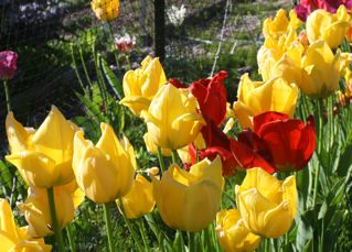
 In the photo to the right, the larger red arrangement dominates the yellows.
Another way would have been to have more light (value) on the red tulip and less on the yellow, or to dull the yellow compared to the red.
 Another problem with yellow is how to shade it. A student wrote me this month asking for help.
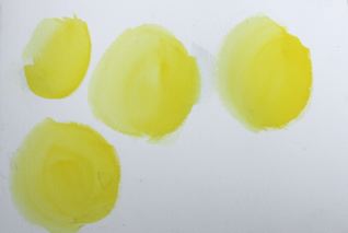
Here are four shapes, darker on the right and less dark on the left, of cadmium yellow pale or light.
Modeling with the yellow alone does not work. The value is so light or high ke you can’t get a darker one no matter how much yellow you use.
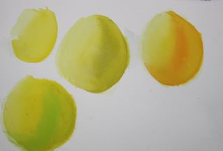 Next, I left the top left one is the same but wet the other three with clean water.
The one in the center top was modeled using the compliment, violet.
The one to the right was modeled or shaded going from clean water to orange and then to yellow and orange mixed on the right side.
The bottom one was modeled with green — green gold and thalo green.
None of them really look “right.”
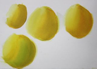 After they were dry, I wet them again and modeled them with yellow — both cadmium light and Hansa yellow. The one with the green is a bit too green (so easy to get heavy handed with yellow).The other two appear convincingly modeled or shaded yellow shapes.
Looking a bit duller but still shaded is the one on the upper left. In it the violet and yellow were mixed together with a little orange added. Glazing acheives a more luminous look.
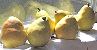
Look at the pears in the photograph above and ask yourself where you would choose the violet with a second glaze or yellow over it; where the orange would be a better choice, and where the green.
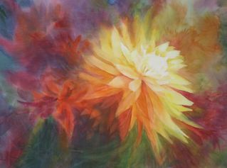
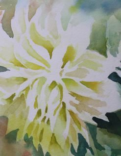 This is a close up of a dahlia in a summer garden.
Where the sun was striking the dahlia, I left the paper white. The yellow is blended with orange on the right, with green on the left.
In Big Yellow, that starts this posting, study how the colors are moderated in it… yellow, orange and when I needed to go even darker, I used red.
Compare those shadows to the ones that are left in green.
Enjoy the energy and sparkle of yellow. It is a grand hue.
However, remember, yellow may be the Diva, but you are in the director’s seat.
Happy painting,
Caroline