 Have you noticed how dark and rich shadows are in summer? Do you get flat ugly color when you try to get darks? How do you get colors dark enough? How do you get dark enough without getting mud or an ugly color that does not look right? Getting good darks are a natural next step to last month’s green problem.
Dark or light is value. I like to think of the value of a hue (a color) as similar to voice. Some of us are sopranos. Some of us altos and some tenors, baritones, even bass. I, for example, I am a soprano. I cannot get the rich low notes of a baritone. In the same way each hue has a natural value (voice) and it is at its lowest (darkest) value as it comes from the tube. Orange is a lower value than yellow. Violet is darker than orange.
When you thin a pigment with water it gets lighter. But you can go no darker than the full saturation of that particular pigment without changing the hue. It is no longer that color.
Get out your palette:
- Load your wet brush with your darkest most-baritone blue (my darkest blue is phthalo blue) and stroke it on the paper at full saturation — no gooey pigment. Look at it. Can you get it as dark as water under a dock?
- Add your most baritone green — mine is phthalo; maybe yours is Hooker’s or Cascade. Now it is darker but also greener.
- Add your strongest staining red — alizarin, or quinacridone, or anthraquinoid
Now it is dark. But wait! Did it go black? If it is not blue any more, then re-blue it! Voila!
 Try it with an orange or a yellow. To darken them, cross the color wheel to the compliment (opposite) hue. With orange, you would use blue. (Oops — not too much!) With yellow, a violet. (Ugh!! What an ugly color! If it is brown, add some blue until it goes gray.) Now, re-charge it with the yellow or the orange and see if it doesn’t look right.
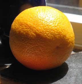
Try painting a lemon in light. And an orange:
- Thin it toward the light.
- As you go out of the light, first add more of the hue you started with until you are at full saturation.
- Then add some of the compliment
- when it is dark enough recharge it with the initial hue until it looks like an orange or lemon in shadow.
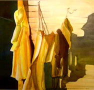
In the dark door in Slickers and Jackets on the Line, I wet the area and socked it with a very strong saturation of phthalo blue adding ultramarine blue, burnt orange and some phthalo green to get it darker and give it some shift in hue within the dark.
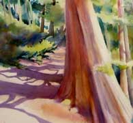
Note how the cast shadows in the fragment of Trail to the Falls bring out the sunlight. But the small darks tucked into the greens are working very hard to convince us on the sunshine. Without them the feeling of sun would be greatly weakened.
Warning: with flowers, don’t cross the color wheel! Go darker by stepping one color over on the color wheel toward cool — violet for a red; orange for a yellow (or green but not both); For violet — more red-violet toward the light, and a darker blue violet for the shadow.
If you gray flowers, they look old and wilted. Try it and see if you agree. The rule to keep flowers looking fresh is to not have more than two primaries in any one mix: yellow and orange include yellow and red; yellow and green include yellow and blue. Mix them together and you have all 3 primaries and a dull, limp yellow.
You may go to the Gallery section to look at shadow colors on the flowers there.
You can also get to darks by glazing but we will save those for another time.
© Caroline Buchanan, 2008