 Do you find working with color confusing? I will admit it is a constant challenge because of its shifting nature, but if you view color as a dance it may no longer be confusing.

TAKE YOUR PLACE
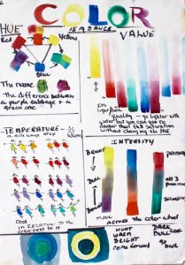
Think of the color wheel as a circle. The colors that take their place on this circle are the 3 primaries and 3 secondaries. Think of a prism. Think of the rainbow or the color that comes through a crystal. When speaking of these colors we use the word HUE.
The difference between a purple cabbage and a green cabbage is its HUE.
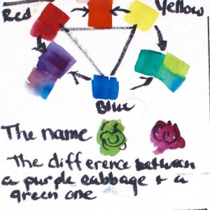
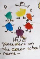
Take your place on the circle. That is the same as what color (hue) are you going to paint with now…. Green! Or Violet! Choose and you have chosen your place on the circle.
VALUE – HOW LIGHT OR DARK a violet? or green?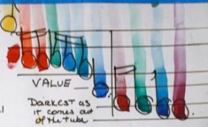
Each hue has a value that it is “born” with the way you have brown eyes or blue. Or whether your singing voice is bass or soprano. The natural value of a hue is the light-darkness of that pigment as it comes out of the tube.
Some are very light. Yellow is lighter than any of the other 6 by a large margin. It is the soprano that stands out from the rest of the group because it can go higher (lighter) at full strength. Yes you can make it even lighter. But! You cannot make yellow darker without changing the hue, adding another color.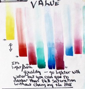
Orange, pink, quinacridone gold, cobalt teal and others would be our altos. Reds and some greens and blues are tenors. Baritones are hues such as pthalo blue and green, aquamarine blue. Try placing your other colors.
This means these hues strength resonates as these lower ranges. To match the value of (for example) orange or yellow with a baritone green in watercolor all we have to do is add water. We can match the value but they will not have the same power and a naturally higher or lighter one.
Standing on your place on the circle, your chosen hue, you can go darker (down, down, down)by adding more paint, more pigment more paint on your brush. Until you get to “full saturation.” That’s it. Or you can go lighter (up, up, up) by simply adding more water to the puddle on your palette.
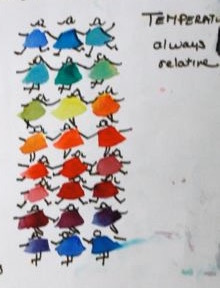
Each hue-girl stands between a warmer, and a cooler version of herself. Then the warmer move to the next row where she is the cooler of the three… until we get to the other side of the wheel and it is in reverse
TEMPERATURE – HOW WARM? HOW COOL
You are on your chosen color and let’s say that making it lighter or darker doesn’t achieve the hue you want. You can move on the circle, on the color wheel a little bit to one side toward the color of flames, of coals in a fire — a yellow orange. You are moving to make your hue WARMER.
Or you can move toward the color of glacial ice down in a crevasse, making your hue COOLER.
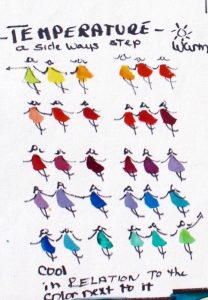 Take for example, your quinacridone violet. Oh no! It is too warm. Add a little thalo blue and bring it to the cooler violet you wanted.
You are staying on the circle, on the prism or pure color, so long as you only include TWO PRIMARIES in your mix. Warm your violet further by adding some quin. red but not cadmium red. Cadmium red is to the orange side of pure red. You are also dulling your mix with the third primary (yellow).
INTENSITY – BRIGHTNE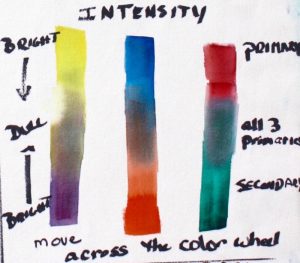 SS/DARKNESS
Sometimes you want to go duller. Think of it as the do-se-do. Fold your arms and skip toward the hue opposite you.
Notice that opposite each of the primaries is the secondary composed of the other two primaries.
Black or pure gray is an equal amount of all three. 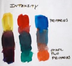
Practice making gray by combining each of your secondaries (orange, green, violet) with the primary opposite it on the color wheel.
When you don’t get gray, ask yourself which of the primaries is under represented. Maybe your orange is a yellow-orange and you are green-gray. Add more red, etc.
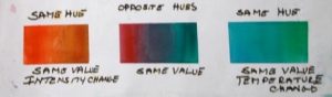
Exercise:
Here is a good way to practice these relationships. The first shows a change in the same hue (and same value) from brighter to duller. The next shows crossing the color wheel and getting a gray in the middle the same value as the red on one side and the green on the other. The third shows same hue, same value, changing the hue (in the center) from cooler on the left to warmer on the right.
One final point: 
Relatively warmer, brighter, lighter shapes come forward.
Relatively cooler, duller, darker shapes recede.
Knowing and using this is key to color design.
Happy painting. Let your brush dance around your palette!
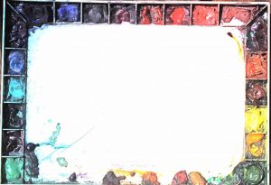
My palette with my colors in a color wheel. See Equipment or Basic Watercolor class for the names of the pigments.
Caroline